I have now finished all my practical tasks, unfortunately i cannot upload the trailer on to my blog, but here is the URl to it on YouTube - http://www.youtube.com/watch?v=K0GaxBiAVjQ
Here is my evaluation:
In response to the brief given to me at the beginning of the topic, I have created two ancillary tasks that consist of a film magazine cover and a poster promoting the film. The main task that I completed was the two minute trailer as described in the brief. Once given the brief I immediately started brainstorming genres of films, then I finally decided to do a psychological thriller. I chose this because of the kind of films I watch myself, I know the conventions of them and I am familiar with the type of narrative they portray. Two films in particular that I had watched previous helped kick start my research; One Hour Photo and Hard Candy. Both of these films were on an internet list I found that told me the top 20 psychological thrillers, so I knew they were in the right genre. These two films followed the expectations of this genre by conveying narratives of being stalked, or spied on. Hard Candy was from the point of view of the female being stalked (or rather under the control of a paedophile), this is more typical of a plot that involves stalking, as opposed to in One Hour Photo where we see through the eyes of the male character, this goes against convention. Through further research into this film, I decided to make mine go against convention, as mine is through the eyes of my stalker character. Once I decided on my narrative structure and my genre, I went on to You Tube to find the film trailers I found from the online list. I watched the Hard Candy and One Hour Photo trailers, along with ones such as; Hannibal, Silence of the Lambs and The Hand That Rocked the Cradle. This was my secondary research which helped me comprehend more conventions of this genre, and the type of things included in their trailers. I went on to do primary research which involved creating a questionnaire (see blog post above) and then asking people several questions, recording their answers using a digital voice recorder. I then went to upload this as a video. From my research of film trailers I found that the voice over doesn’t always follow the convention of a typical ‘big Hollywood voice over man’, and in the trailer they don’t give much away; they often include ‘sinister’ and ‘creepy’ sounds. When receiving the results from my questionnaire, candidates said that they liked the suspense element and the unsuspecting factor, the images in the trailer hooked them, the fast paced trailers and the genre of music to be rock or classical. I took this into consideration when creating the main task from the brief. One important aspect of the brief to consider was that I had to produce a promotional package, so I needed to ensure that my ancillary texts combined with my trailer. After looking on the top twenty psychological thrillers list, I found more films and started looking at their posters. This was my secondary research so I could find out what was included on posters, I didn’t feel I needed to do any primary research because I found many psychological thriller posters that provided me with plenty information. 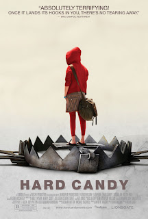 When thinking about doing my magazine cover, the secondary research I did involved looking at examples; like Empire magazine. I did primary research in the form of a questionnaire (see blog post above) because I felt that I needed to find out what people would expect from a film magazine, as there are only a few examples out there.
  I posted on my blog above what I found out from my questionnaire. At this point, I had results from primary and secondary research that meant I could start planning the making of the tasks, I started this in October. First I took pictures of my actors for my film magazine cover, then I started editing these on Adobe Photo Shop and then later went on to produced my final cover on Quark. I combined starting my film magazine cover with researching places to shoot my trailer. At college I would make progress on Photo Shop/Quark and when at home I would be going round my town looking for ‘sinister’ locations. I then produced on my blog (see above) a video called ‘update’ of me speaking on what my decisions were regarding my locations for scenes, character motifs, voice over’s and any props/clothes used. By December I had finished my film magazine cover and had started filming, at this point I started to do my poster as well (this was all done on Photo Shop). By the beginning of March I had finished filming and had all my final footage ready for editing, I was also near finished on my poster (by mid March I had finished). From this time onwards I was able to solely focus on editing my trailer, and by the end of March I had considered myself finished. I think that the time scale throughout completing the tasks was reasonable, I finished ahead of time and all that I had to do in the 2 weeks that followed was to complete this evaluation ready to hand in at the correct time. I did not need to rush at any point throughout the production so I was able to make sure my coursework was up to a respectable standard in my eyes. I will now go on to analyse the tasks individually and talk of any problems I had and the conventions that I followed/challenged. Firstly I will talk about the two ancillary tasks that I completed. As stated above, the genre I chose was psychological thriller and I needed to interpret that into my magazine cover and poster. The picture I took for the magazine I thought worked really well, I made sure she had a scared look in her eyes and tried to make her mouth so she wasn’t at all smiling. In Photo Shop I edited her face slightly to get rid of red eye and the hint of smile she had. I chose the title ‘flicks’ because I wanted a word that was similar to movie, because I was doing the cover of a film magazine. The font I used for my magazine i thought also worked well to portray a ‘creepy’ element, I used ‘chiller’ font for part of it as this gave a good effect. I found Photo Shop at first quite hard to use, when it came to cutting part of my actress out of the picture and adding a black background, going round her fingers made the final attempt look a bit blurry. To keep with the promotional package, I put a picture of my poster in the bottom left corner as a feature that came with the magazine. Over all I feel as though my magazine cover came out exactly as I wanted it, I think it looks like film magazines already out there so correctly follows those conventions. Moving on to my poster, the image I took for this I knew was going to be the only background, so it had to be perfect. I settled with a picture that used flash on the camera to make the foreground actor more visible than the background actor, this was because he is the stalker and I wanted to use the conventions of him being hidden. The expression on the females face is perfect, just how I wanted it, she looks worried. The male however could have perhaps leant his head down slightly more, so as to have his face more obscured. I included all the conventions of a film poster, such as; title, slogan, information at the bottom, certificate, the film company’s name and reviews. My poster layout derived eventually from the
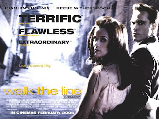 Walk the Line poster that I have seen, like mine it just has three words for its reviews, gradually getting bigger as they are listed. I wanted to make my simple but effective, and I think that I have achieved this. After planning my sequence of clips, and what was to be in my trailer, I realised that my trailer goes against those typical conventions of a stalker themed film. The male stalking in mine is the one I focus on, he is what you could call a ‘Byronic hero’ in the sense that despite being the antagonist, the film is through his point of view, and I aim for the audience to value his point of view. On my blog above, I have videoed myself explaining my sequence of shots and briefly why I chose them, I will talk a little bit more in depth now. The opening scene includes three girls who have just finished dates with this man (whom is wearing the same jumper throughout so the audience can identify his character), the 3rd girl being the one whom we follow throughout. I tried to make sure that you couldn’t see the name of the restaurant, but on the second girl you can, so I would improve this if I could. I sped this sequence up to emphasise just how many dates he goes on, he is a very lonely man. The music playing is of a soft piano noise, this contrasts the quick pace of the clip. There is then the close up of the girl saying the all important words “I had a great time, I’ll call you” – she then obviously doesn’t call him back, which is the main reason for the plot. We then see a tracking shot of her walking away, accompanied by the start of the creepy music that I thought worked well with the genre. We then see the girl walking her dog casually; she then spots a man sitting on a bench reading the paper, this is accompanied by a stinger sound, she thinks nothing of it and walks away. There is then a slow zoom, accompanied by the creepy music, to show the conspicuous man who I made follow conventions because he is reading a paper to cover his face. There is then a transition to the next scene which includes a pan across a wall covered with pictures, the pictures are those the stalker has collected of either his victims, pictures he’s taken or ones he’s derived from Facebook. This is accompanied by the voice over of the actress saying “he was a bit disjointed and kind of sinister”. The following scenes are important because they give the audience a look at the stalkers life. The scenes in the room are filmed in my house, I had to re-arrange the room to make it look like a typical bedroom, and I included props such as a laptop, lamp, stationary, newspaper, books, CDs, DVDs, a bed and a chair. I used some slow zooms in to the computer screen to create intensity; the music was accompanied here when the zoom goes close to the girls face on the screen. The following scene is when the stalker has identified the house and knocks on her door, the lighting in this scene is perfect and the door is good in creating a creepy effect of barely seeing the stalkers face. The man knocks and the girl answers with “I’m sorry who are you?” which further adds to the insignificance of the man. Before the girl answers the door there is a voice over saying “an insignificant man”, I tried to find someone with a deep voice and I think the one I chose worked really well. I followed conventions here because I didn’t use a big ‘Hollywood man’ to do the voice over and I only used four voice over’s throughout, and one of those was the girl speaking as if she was speaking from the actual full film. The next scene shows the stalker walking up the stairs holding a knife; this is the main reason why I certificated my film as fifteen as there themes of violence. I used a tracking shot to follow him up the stairs and then tilted down to get a shot of the knife before fading away, the lighting here was used to emphasise the importance of the knife. The music that accompanies this scene was used to create tension, and matches the steps as he walks up the stairs. The screen then goes black and a scream occurs, I found the scream on the Macs and I think it works well but I would have rather had a real scream, but I struggled to get the perfect one. The scene after is of the girl running away, I shot this using different shot types; a slow zoom as she runs, a tracking shot of her feet, the camera placed on the ground as she ran past and then a tracking shot as she ran then looked behind her. The music here is not playing because the sound from the crunching on the gravel was already a good effect. We then see the actress standing, staring with a scared look on her face. Here I found a ‘heavy breathing’ effect to add how scared she would be feeling. There is then the title which I have called ‘call me…’ and then the last shot you see is of the stalker walking away, this is cut from the knocking on the door scene. It then fades to a slogan saying ‘this could be your last’ and then the release date. Over all I am very happy with the way my trailer turned out, the conventions of a psychological thriller trailer and kept mostly the same but my plot I have gone against conventions. The problems I faced in editing were the lighting and the sound; I should have paid more attention to the wind when filming because in editing it was really loud and hard to cover up. The scenes filmed in the evening looked fine on the camera, but when editing they were a lot darker. I used ‘colour corrector 3-way’ to attempt to change the light levels but it made it look slightly grainy.
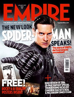
 When thinking about doing my magazine cover, the secondary research I did involved looking at examples; like Empire magazine. I did primary research in the form of a questionnaire (see blog post above) because I felt that I needed to find out what people would expect from a film magazine, as there are only a few examples out there.
  I posted on my blog above what I found out from my questionnaire. At this point, I had results from primary and secondary research that meant I could start planning the making of the tasks, I started this in October. First I took pictures of my actors for my film magazine cover, then I started editing these on Adobe Photo Shop and then later went on to produced my final cover on Quark. I combined starting my film magazine cover with researching places to shoot my trailer. At college I would make progress on Photo Shop/Quark and when at home I would be going round my town looking for ‘sinister’ locations. I then produced on my blog (see above) a video called ‘update’ of me speaking on what my decisions were regarding my locations for scenes, character motifs, voice over’s and any props/clothes used. By December I had finished my film magazine cover and had started filming, at this point I started to do my poster as well (this was all done on Photo Shop). By the beginning of March I had finished filming and had all my final footage ready for editing, I was also near finished on my poster (by mid March I had finished). From this time onwards I was able to solely focus on editing my trailer, and by the end of March I had considered myself finished. I think that the time scale throughout completing the tasks was reasonable, I finished ahead of time and all that I had to do in the 2 weeks that followed was to complete this evaluation ready to hand in at the correct time. I did not need to rush at any point throughout the production so I was able to make sure my coursework was up to a respectable standard in my eyes. I will now go on to analyse the tasks individually and talk of any problems I had and the conventions that I followed/challenged. Firstly I will talk about the two ancillary tasks that I completed. As stated above, the genre I chose was psychological thriller and I needed to interpret that into my magazine cover and poster. The picture I took for the magazine I thought worked really well, I made sure she had a scared look in her eyes and tried to make her mouth so she wasn’t at all smiling. In Photo Shop I edited her face slightly to get rid of red eye and the hint of smile she had. I chose the title ‘flicks’ because I wanted a word that was similar to movie, because I was doing the cover of a film magazine. The font I used for my magazine i thought also worked well to portray a ‘creepy’ element, I used ‘chiller’ font for part of it as this gave a good effect. I found Photo Shop at first quite hard to use, when it came to cutting part of my actress out of the picture and adding a black background, going round her fingers made the final attempt look a bit blurry. To keep with the promotional package, I put a picture of my poster in the bottom left corner as a feature that came with the magazine. Over all I feel as though my magazine cover came out exactly as I wanted it, I think it looks like film magazines already out there so correctly follows those conventions. Moving on to my poster, the image I took for this I knew was going to be the only background, so it had to be perfect. I settled with a picture that used flash on the camera to make the foreground actor more visible than the background actor, this was because he is the stalker and I wanted to use the conventions of him being hidden. The expression on the females face is perfect, just how I wanted it, she looks worried. The male however could have perhaps leant his head down slightly more, so as to have his face more obscured. I included all the conventions of a film poster, such as; title, slogan, information at the bottom, certificate, the film company’s name and reviews. My poster layout derived eventually from the
 Walk the Line poster that I have seen, like mine it just has three words for its reviews, gradually getting bigger as they are listed. I wanted to make my simple but effective, and I think that I have achieved this. After planning my sequence of clips, and what was to be in my trailer, I realised that my trailer goes against those typical conventions of a stalker themed film. The male stalking in mine is the one I focus on, he is what you could call a ‘Byronic hero’ in the sense that despite being the antagonist, the film is through his point of view, and I aim for the audience to value his point of view. On my blog above, I have videoed myself explaining my sequence of shots and briefly why I chose them, I will talk a little bit more in depth now. The opening scene includes three girls who have just finished dates with this man (whom is wearing the same jumper throughout so the audience can identify his character), the 3rd girl being the one whom we follow throughout. I tried to make sure that you couldn’t see the name of the restaurant, but on the second girl you can, so I would improve this if I could. I sped this sequence up to emphasise just how many dates he goes on, he is a very lonely man. The music playing is of a soft piano noise, this contrasts the quick pace of the clip. There is then the close up of the girl saying the all important words “I had a great time, I’ll call you” – she then obviously doesn’t call him back, which is the main reason for the plot. We then see a tracking shot of her walking away, accompanied by the start of the creepy music that I thought worked well with the genre. We then see the girl walking her dog casually; she then spots a man sitting on a bench reading the paper, this is accompanied by a stinger sound, she thinks nothing of it and walks away. There is then a slow zoom, accompanied by the creepy music, to show the conspicuous man who I made follow conventions because he is reading a paper to cover his face. There is then a transition to the next scene which includes a pan across a wall covered with pictures, the pictures are those the stalker has collected of either his victims, pictures he’s taken or ones he’s derived from Facebook. This is accompanied by the voice over of the actress saying “he was a bit disjointed and kind of sinister”. The following scenes are important because they give the audience a look at the stalkers life. The scenes in the room are filmed in my house, I had to re-arrange the room to make it look like a typical bedroom, and I included props such as a laptop, lamp, stationary, newspaper, books, CDs, DVDs, a bed and a chair. I used some slow zooms in to the computer screen to create intensity; the music was accompanied here when the zoom goes close to the girls face on the screen. The following scene is when the stalker has identified the house and knocks on her door, the lighting in this scene is perfect and the door is good in creating a creepy effect of barely seeing the stalkers face. The man knocks and the girl answers with “I’m sorry who are you?” which further adds to the insignificance of the man. Before the girl answers the door there is a voice over saying “an insignificant man”, I tried to find someone with a deep voice and I think the one I chose worked really well. I followed conventions here because I didn’t use a big ‘Hollywood man’ to do the voice over and I only used four voice over’s throughout, and one of those was the girl speaking as if she was speaking from the actual full film. The next scene shows the stalker walking up the stairs holding a knife; this is the main reason why I certificated my film as fifteen as there themes of violence. I used a tracking shot to follow him up the stairs and then tilted down to get a shot of the knife before fading away, the lighting here was used to emphasise the importance of the knife. The music that accompanies this scene was used to create tension, and matches the steps as he walks up the stairs. The screen then goes black and a scream occurs, I found the scream on the Macs and I think it works well but I would have rather had a real scream, but I struggled to get the perfect one. The scene after is of the girl running away, I shot this using different shot types; a slow zoom as she runs, a tracking shot of her feet, the camera placed on the ground as she ran past and then a tracking shot as she ran then looked behind her. The music here is not playing because the sound from the crunching on the gravel was already a good effect. We then see the actress standing, staring with a scared look on her face. Here I found a ‘heavy breathing’ effect to add how scared she would be feeling. There is then the title which I have called ‘call me…’ and then the last shot you see is of the stalker walking away, this is cut from the knocking on the door scene. It then fades to a slogan saying ‘this could be your last’ and then the release date. Over all I am very happy with the way my trailer turned out, the conventions of a psychological thriller trailer and kept mostly the same but my plot I have gone against conventions. The problems I faced in editing were the lighting and the sound; I should have paid more attention to the wind when filming because in editing it was really loud and hard to cover up. The scenes filmed in the evening looked fine on the camera, but when editing they were a lot darker. I used ‘colour corrector 3-way’ to attempt to change the light levels but it made it look slightly grainy.


